Which Artist Utilized Ben-Day Dots in His Artwork? Roy Lichtenstein Explained
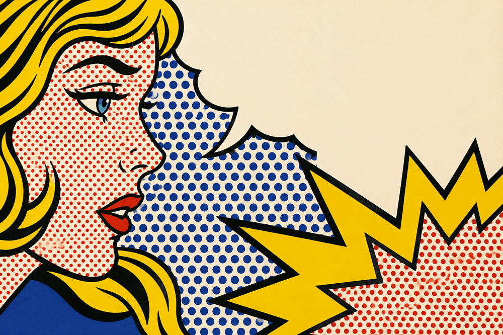
The artist most famous for utilizing Ben-Day dots in his artwork was Roy Lichtenstein, one of the leading figures of American Pop Art. Beginning in the early 1960s, Lichtenstein enlarged the tiny dot patterns associated with inexpensive commercial printing and comic books until they became one of the most recognizable features of his paintings.
His paintings often combined these dots with thick black outlines, flat areas of bright primary color, speech balloons, and imagery adapted from advertisements or comic panels.
The result looked mechanical even though much of it was carefully constructed by an artist.
That contradiction was central to Lichtenstein’s work. He took visual techniques associated with cheap, mass-produced images and moved them into museums and galleries, forcing viewers to reconsider the line between commercial illustration and fine art.
Who Used Ben-Day Dots in Art?
Roy Lichtenstein is the artist most closely associated with Ben-Day dots.
Lichtenstein was an American artist born in New York City in 1923. He became a central figure in the Pop Art movement during the 1960s alongside artists such as Andy Warhol.
The Museum of Modern Art describes him as a key Pop artist whose work began borrowing imagery from comic books and advertisements before expanding into subjects from everyday life and art history.
His use of dots became so recognizable that today a field of red, blue, or yellow dots beside a thick black outline can immediately suggest Lichtenstein even when the viewer does not know the name of the technique.
But Lichtenstein did not invent Ben-Day dots.
He transformed an existing commercial printing process into an artistic language.
What Are Ben-Day Dots?
Ben-Day dots are small colored dots arranged in patterns to create shading, texture, and different visual tones in printed images.
They take their name from illustrator and printer Benjamin Henry Day Jr., whose printing process became associated with the technique.
Before inexpensive full-color printing became easy, printers could create the illusion of additional tones without using a separate ink for every possible color.
Imagine a white background covered with evenly spaced red dots.
Viewed closely, you can see individual red circles surrounded by white space.
Move farther away and your eye begins blending the red and white together. The area may appear pink.
Change the size or density of the dots, and the apparent shade changes.
Similar methods allowed inexpensive publications to suggest a much broader range of colors while working with a limited set of inks.
Ben-Day dots therefore originally belonged to the practical world of reproduction.
Lichtenstein made viewers notice them.
Why Did Roy Lichtenstein Use Ben-Day Dots?
Lichtenstein was interested in the visual language of mass-produced culture.
Rather than hiding the mechanisms used to print a commercial illustration, he exaggerated them.
A dot that would normally be nearly invisible on a cheaply printed comic page could become large enough to inspect individually on a painting.
That changed its meaning.
A printing shortcut became an aesthetic choice.
MoMA notes that Lichtenstein used Ben-Day dots together with bold outlines, flat areas of primary color, and simplified compositions—visual elements closely associated with mass-market printed imagery.
This allowed him to produce an unusual effect.
His paintings looked as though they had come directly from a printing press.
But they were hanging in an art gallery.
That tension was part of the point.
Did Lichtenstein Paint the Dots by Hand?
Lichtenstein’s dots were not simply enormous comic pages mechanically reproduced on canvas.
He developed studio methods for producing the controlled patterns he wanted, including the use of perforated screens and stencils.
The final result intentionally looked impersonal.
Traditional painting often celebrates visible brushwork.
You may look at a painting and imagine the artist’s hand moving across the canvas.
Lichtenstein frequently pushed in the opposite direction.
The regular dots, hard outlines, and flat colors could make the picture appear manufactured.
The irony was that considerable artistic planning was required to achieve that supposedly mechanical appearance.
The work looked industrial because the artist carefully made it look industrial.
Did Roy Lichtenstein Invent Ben-Day Dots?
No.
Lichtenstein did not invent the printing technique.
What he did was appropriate, enlarge, simplify, and transform it for fine art.
This distinction matters.
Ben-Day dots existed in commercial printing before Lichtenstein became famous. His achievement was recognizing that a visual device most people ignored could become a subject in itself.
In an ordinary printed image, the dots were supposed to disappear.
You were supposed to see a face, car, explosion, or dress.
Lichtenstein made the dots impossible to ignore.
Instead of being merely the technology behind an image, they became part of what the image was about.
How Did Comic Books Influence Roy Lichtenstein?
Comic-book imagery became central to Lichtenstein’s breakthrough work during the early 1960s.
He borrowed the appearance of dramatic commercial illustrations: romantic confrontations, fighter pilots, explosions, crying women, speech bubbles, exaggerated expressions, and intense moments that appeared to have been removed from a larger story.
MoMA describes comic books and advertisements as important sources for his early Pop work.
Lichtenstein then altered and simplified those sources.
A small printed panel could become a huge painting.
Background details might disappear.
The composition could be rearranged.
Colors could become flatter and stronger.
Lettering and dots could become more visually dominant.
Once enlarged, something originally designed to be consumed quickly could demand prolonged attention inside a museum.
What Famous Roy Lichtenstein Paintings Use Ben-Day Dots?
One of the best-known examples is Drowning Girl, created in 1963.
The painting shows a distressed woman surrounded by stylized waves, with a speech balloon suggesting a larger romantic drama.
MoMA identifies the work with Lichtenstein, Pop Art, and Ben-Day dots.
Other famous works associated with his comic-inspired approach include Whaam!, Look Mickey, and various paintings featuring melodramatic romantic or military imagery.
The individual scenes differ, but the visual vocabulary remains recognizable:
Dots.
Black outlines.
Flat color.
Commercial imagery.
A carefully artificial appearance.
These features became so strongly associated with Lichtenstein that they eventually influenced everything from advertising and fashion to graphic design and contemporary digital illustrations.
Were Ben-Day Dots Only Used in His Comic-Book Paintings?
No.
That is one of the most interesting parts of Lichtenstein’s career.
He did not abandon the dot vocabulary when he began moving beyond comic-book subjects.
The Metropolitan Museum of Art notes that even after Lichtenstein moved away from the comic-book imagery that first made him famous, he continued using a graphic vocabulary that included Ben-Day dots, diagonal marks, black outlines, and strong areas of color.
He applied these techniques to landscapes and even to reinterpretations of earlier art movements.
His Haystacks series, for example, reconsidered a subject famously associated with Claude Monet.
But instead of Impressionist brushstrokes describing shifting light, Lichtenstein used his own industrial-looking visual vocabulary.
The Smithsonian American Art Museum notes that the dot patterns in Lichtenstein’s Haystacks #3 refer to Ben-Day dots and halftone printing.
The comparison is clever.
Monet repeatedly painted haystacks to explore changing light and atmosphere.
Lichtenstein recreated the idea using the language of mechanical reproduction.
Why Did Ben-Day Dots Become So Important to Pop Art?
Pop Art challenged assumptions about what subjects and images belonged in serious art.
For generations, museums had been associated with landscapes, portraits, mythology, religion, historical scenes, and other traditional subjects.
Pop artists looked at the world surrounding ordinary consumers.
They saw:
- Advertisements
- Product packaging
- Newspapers
- Comic strips
- Celebrity photographs
- Billboards
- Household objects
- Mass-produced entertainment
Instead of treating those things as visually inferior, they turned them into material for art.
Lichtenstein’s dots were perfect for that project because they immediately suggested mechanical reproduction.
They represented a world where the same image could be printed thousands or millions of times.
Yet Lichtenstein enlarged that supposedly disposable visual language into objects displayed as unique works of fine art.
The cheap became expensive.
The disposable became permanent.
The mass-produced appearance entered the museum.
That contradiction helps explain why the dots matter far beyond their decorative appearance.
What Is the Difference Between Ben-Day Dots and Halftone Dots?
The terms are sometimes used loosely because both techniques use patterns of dots to create the appearance of different tones.
They are related, but they are not exactly identical printing processes.
Ben-Day patterns were applied according to a mechanical printing method involving predetermined patterns of dots, lines, or textures.
Halftone printing generally uses dots that vary in size or spacing to reproduce tonal variation in an image.
For someone simply trying to recognize Lichtenstein’s work, the technical distinction is less important than the visual principle:
small separated marks can appear to form continuous tones when viewed from a distance.
Lichtenstein exaggerated that effect until viewers could see both things at once.
You see the woman’s skin.
And you see the dots creating the woman’s skin.
That double awareness is part of what makes his work visually distinctive.
Did Andy Warhol Use Ben-Day Dots?
Andy Warhol and Roy Lichtenstein are frequently connected because both became major Pop artists and both borrowed from commercial visual culture.
But Ben-Day dots are most strongly associated with Roy Lichtenstein.
Warhol became more closely associated with techniques such as silkscreen printing and repeated images of celebrities and consumer products.
The difference illustrates how two artists could respond to the same mass-media environment in very different ways.
Warhol often emphasized repetition: one famous face or commercial image appearing again and again.
Lichtenstein often emphasized the visual construction of the printed image itself.
His dots practically announce:
This picture looks printed.
That self-conscious artificiality became one of his trademarks.
Why Did Lichtenstein’s Art Become Controversial?
Lichtenstein’s use of comic imagery has generated considerable debate because many of his source images came from work originally created by commercial comic artists.
His paintings could transform a relatively small comic panel into a famous and extremely valuable museum artwork while the original illustrators often remained unknown to the general public.
That raises difficult questions about appropriation.
When does borrowing become transformation?
How much does an artist need to alter an existing image before it becomes a new work?
Why were images dismissed as disposable commercial illustration when drawn by comic artists but celebrated as important fine art after being reworked and placed on a canvas?
Those questions remain relevant to Lichtenstein’s reputation.
They also make the dots more interesting.
His work was never simply about copying the appearance of comic books.
It exposed the uneasy relationship between original art, reproduction, mass media, authorship, and cultural prestige.
Why Are Lichtenstein’s Dots Still Recognizable Today?
The most successful visual styles can become detached from the artist who created or popularized them.
That has happened with Lichtenstein.
Today, advertisements, posters, social-media graphics, clothing, and illustrations frequently use:
- Large colored dots
- Thick black outlines
- Comic speech balloons
- Explosive starburst shapes
- Flat red, yellow, and blue colors
The result is often simply described as “Pop Art.”
But much of that visual shorthand owes an enormous debt to Lichtenstein’s work.
SFMOMA specifically describes him as famous for using Ben-Day dots, defining them as the small dots of color associated with commercial printing and newspapers.
Once you know what those dots are called, it becomes difficult not to notice how widely the idea has spread.
The Bottom Line
The artist most famously associated with Ben-Day dots is Roy Lichtenstein.
Lichtenstein became a major figure in American Pop Art by borrowing visual ideas from comic books, advertisements, and commercial printing. He enlarged the normally tiny dots used to create printed tones until the dots themselves became one of the central features of his artwork.
He did not invent Ben-Day dots.
He made them impossible to ignore.
By combining them with bold black outlines, flat primary colors, comic-book imagery, and carefully simplified compositions, Lichtenstein developed one of the most recognizable visual languages of 20th-century art.
And the technique was not limited to his famous comic-inspired paintings.
He continued using dots when exploring landscapes, art history, and subjects associated with earlier painters such as Claude Monet.
That is why the answer to “which artist utilized Ben-Day dots in his artwork?” is so closely associated with one name:
Roy Lichtenstein.
The dots existed before him.
But after Lichtenstein, they became art.